Explore 5 Visualization Tools Experts Rarely Share.
Tool breakdown: When it's best used, why it succeeds, and illustrative examples
Data Enthusiast. Passionate about Problem Solving, Analytical and Critical Thinking.
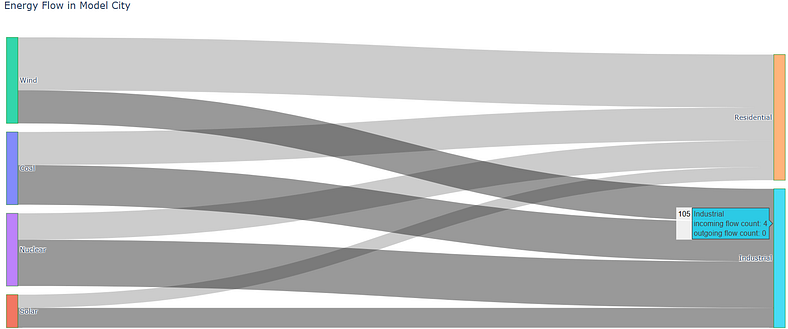
SANKEY DIAGRAMS —
shows how quantities move between different parts of a system.
It is built with:
Nodes — representing stages or entities
Links — connecting nodes, showing flow
— The thickness of each link reflects the size of the flow.
— The direction of the link shows how things move.
When to Use It
Energy production and consumption
Data pipelines or transfers
Traffic or people flow
Supply chain or logistics processes
Why It Works
Spot inefficiencies or bottlenecks
Understand where resources are going
Communicate system-wide flow clearly
Example Use Case
This code makes a flow chart that shows how different energy sources like coal and solar power are sent to places like homes and factories, with thicker lines showing more energy sent.
# Sankey Diagram

import plotly.graph_objects as go

# Define energy sources and consumers
labels = ["Coal", "Solar", "Wind", "Nuclear",
          "Residential", "Industrial", "Commercial"]

# Energy source indices (0–3) flowing to consumers (4–6)
source_indices = [0, 1, 2, 3, 0, 1, 2, 3]
target_indices = [4, 4, 4, 4, 5, 5, 5, 5]
energy_values = [25, 10, 40, 20, 30, 15, 25, 35]

# Create Sankey diagram
fig = go.Figure(data=[go.Sankey(
    node=dict(
        pad=15,
        thickness=20,
        line=dict(color="green", width=0.5),
        label=labels
    ),
    link=dict(
        source=source_indices,
        target=target_indices,
        value=energy_values
    )
)])

# Display chart with title
fig.update_layout(
    title_text="Energy Flow in Model City",
    font_size=12
)
fig.show()
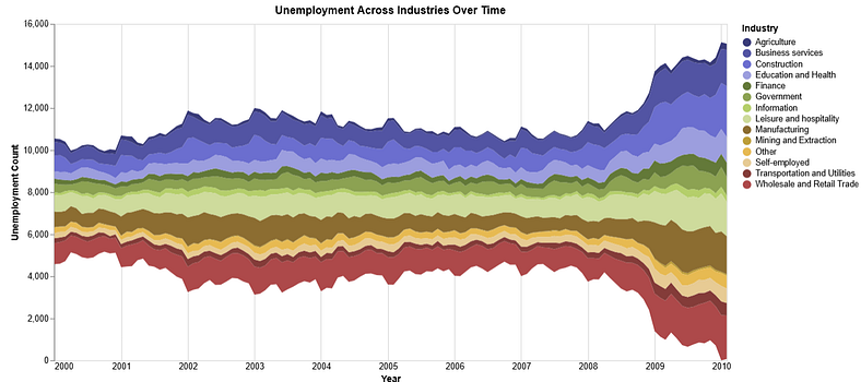
STEAM GRAPH — is a type of a stacked area chart that flows around a central axis creating a more balanced, wave-like shape.
Each layer in the graph represents a category over time, and each is color-coded for clarity.
When to Use It
Stream Graphs are ideal for visualizing time-based data where you want to see how categories change together over time.
Examples include:
Music or content consumption trends
Website or app traffic by source
Sales data across regions or products
Marketing engagement by channel
Unemployment rates across industries
Why It Works
Helps spot patterns and shifts over time
Makes crowded time series easier to compare
Looks clean and engaging when done well
How to Build One
You can create Stream Graphs using the Altair visualization library in Python.
Example Use Case
This code creates a colorful, interactive chart that shows how unemployment in different industries has changed over time, then saves it as a web page you can open in your browser.
    # You need to first do pip install vega_datasets altair

    import altair as alt
    import pandas as pd
    from import altair as alt
    import pandas as pd
    from vega_datasets import data
    import webbrowser

    # Enable Altair for large datasets (if needed)
    alt.data_transformers.disable_max_rows()

    try:
        # Load the unemployment dataset directly into a DataFrame
        source = data.unemployment_across_industries()

        # Create the area chart
        chart = alt.Chart(source).mark_area().encode(
            x=alt.X('yearmonth(date):T',
                    axis=alt.Axis(format='%Y', title='Year', domain=False, tickSize=0)
            ),
            y=alt.Y('sum(count):Q',
                    stack='center',
                    axis=alt.Axis(title='Unemployment Count', grid=False)
            ),
            color=alt.Color('series:N',
                            scale=alt.Scale(scheme='category20b'),
                            legend=alt.Legend(title='Industry')
            )
        ).properties(
            title='Unemployment Across Industries Over Time',
            width=800,
            height=400
        ).interactive()

        # Save the chart as an HTML file
        output_file = 'unemployment_chart.html'
        chart.save(output_file)

     import data
    import webbrowser

    # Enable Altair for large datasets (if needed)
    alt.data_transformers.disable_max_rows()

    try:
        # Load the unemployment dataset directly into a DataFrame
        source = data.unemployment_across_industries()

        # Create the area chart
        chart = alt.Chart(source).mark_area().encode(
            x=alt.X('yearmonth(date):T',
                    axis=alt.Axis(format='%Y', title='Year', domain=False, tickSize=0)
            ),
            y=alt.Y('sum(count):Q',
                    stack='center',
                    axis=alt.Axis(title='Unemployment Count', grid=False)
            ),
            color=alt.Color('series:N',
                            scale=alt.Scale(scheme='category20b'),
                            legend=alt.Legend(title='Industry')
            )
        ).properties(
            title='Unemployment Across Industries Over Time',
            width=800,
            height=400
        ).interactive()

        # Save the chart as an HTML file
        output_file = 'unemployment_chart.html'
        chartsave(output_file)
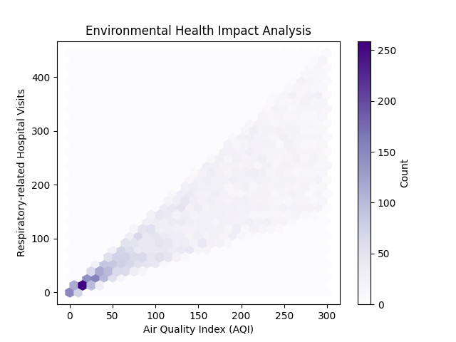
HEXBIN PLOT — is a 2D histogram where data is grouped into hexagonal bins.
Each bin is coloured based on how many data points it contains.
It’s a smarter alternative to scatter plots especially when you’re working with large datasets.
When to Use It
Use a hexbin plot when:
You’re analysing two continuous variables
You have a lot of data points
Your scatter plot looks too dense or messy
Use it when scatter plots fail. It turns noise into insight.
It helps you:
Spot patterns and clusters
Handle over plotting
Show data density clearly
Example Use Case
Let’s say you want to check if poor air quality increases hospital visits.
A hexbin plot can map Air Quality Index (AQI) vs number of hospital visits to reveal any trends or correlations.
        # HEXBIN PLOT
        import matplotlib.pyplot as plt
        import numpy as np

        # Simulating environmental data
        aqi = np.random.uniform(0, 300, 10000)
        hospital_visits = aqi * np.random.uniform(0.5, 1.5, 10000)

        # Creating the hexbin plot
        plt.hexbin(aqi, hospital_visits, gridsize=30, cmap='Purples')

        # Adding a color bar on the right
        cb = plt.colorbar(label='Count')

        # Setting labels and title
        plt.xlabel('Air Quality Index (AQI)')
        plt.ylabel('Respiratory-related Hospital Visits')
        plt.title('Environmental Health Impact Analysis')

        #Show the plot
        plt.show()
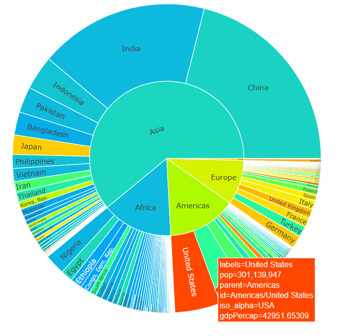
SUNBURST CHART — visualizes hierarchical data in a circular layout.
It shows multiple levels of a hierarchy using rings:
The centre is the root (top level)
Each ring shows the next level down
Each segment represents a category or node
Segment size reflects its value compared to others on the same level
When to Use It
Use a Sunburst chart when you want to show how data is structured in layers. It’s great for:
Market segmentation
Website click paths
Genomic data
File systems
Any nested category structures
Use Sunburst charts to simplify complexity. Perfect when your data has depth.
Why It’s Useful
Interactive and easy to explore
Gives a full picture of distribution at each level
Makes complex hierarchies easy to scan
How to Build One in Python
This code makes a colorful spinning chart that shows how the world’s population is split by continent and country, and uses colors to show how rich each place is based on their average income in 2007.
        # SUNBURST DIAGRAM
        import plotly.express as px
        import numpy as np

        # Load 2007 data from gapminder dataset
        data_2007 = px.data.gapminder().query("year == 2007")

        # Compute weighted average GDP per capita for color scaling
        midpoint = np.average(data_2007['gdpPercap'], weights=data_2007['pop'])

        # Create sunburst diagram
        fig = px.sunburst(
            data_2007,
            path=['continent', 'country'],
            values='pop',
            color='gdpPercap',
            hover_data=['iso_alpha'],
            title='GDP per Capita (PPP$, inflation-adjusted, 2017)',
            color_continuous_scale='rainbow',
            color_continuous_midpoint=midpoint
        )

        # Display the figure
        fig.show()
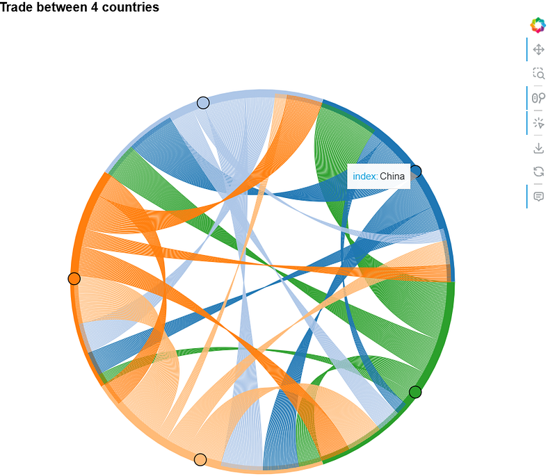
CHORD DIAGRAM — shows relationships between entities in a circular layout. Each entity is placed around the edge of a circle.
— Arcs (or chords) connect them, showing how they relate.
— The thicker the arc, the stronger or more significant the relationship.When to Use It
Use a chord diagram when you want to visualize connections between categories.
It works well for:
Traffic movement between regions
Social network analysis
Gene interactions in genomics
Trade relationships between countries
Why It’s Useful
Highlights key connections in complex datasets
Makes cross-category relationships easy to see
Communicates matrix-style data visually and intuitively
How to Build One
Use Python libraries like Holoviews and Bokeh to create interactive chord diagrams.
For example, I used them to show trade flow between five countries. This code draws a colourful circle chart showing how much stuff five countries sell to each other using lines that connect them.
            #CHORD DIAGRAM

            import holoviews as hv
            from holoviews import opts
            import pandas as pd
            import numpy as np
            from bokeh.io import output_file, show
            from bokeh.resources import INLINE
            hv.extension('bokeh')

            # Sample matrix representing the export volumes between 5 countries
            export_data = np.array([[0, 50, 30, 20, 10],
                                    [10, 0, 40, 30, 20],
                                    [20, 10, 0, 35, 25],
                                    [30, 20, 10, 0, 40],
                                    [25, 15, 30, 20, 0]])

            labels = ['USA', 'China', 'Germany', 'Japan', 'India']

            # Creating a pandas DataFrame
            df = pd.DataFrame(export_data, index=labels, columns=labels)
            df = df.stack().reset_index()

            df.columns = ['source', 'target', 'value']

            # Creating a Chord object
            chord = hv.Chord(df)

            # Styling the Chord diagram
            chord.opts(
                opts.Chord(
                    cmap='Category20', edge_cmap='Category20',
                    title='Trade between 4 countries'.ljust(1000),
                    labels='source', label_text_font_size='10pt',
                    edge_color='source', node_color='index',
                    width=700, height=700
                )
            ).select(value=(5, None))

            # Display the plot and Save to HTML and open in browser
            renderer = hv.renderer('bokeh')
            output_file("chord_diagram.html")
            plot = renderer.get_plot(chord).state
            show(plot)
Feel free to support with your thoughts, feedbacks, 50 x claps and connect with me on LinkedIn and X. You can buy me a coffee .